Customer Portal
The Customer Portal is the interface your customers actually interact with — a standalone web application that takes the conversational flows you've built and serves them directly to borrowers through their browser.
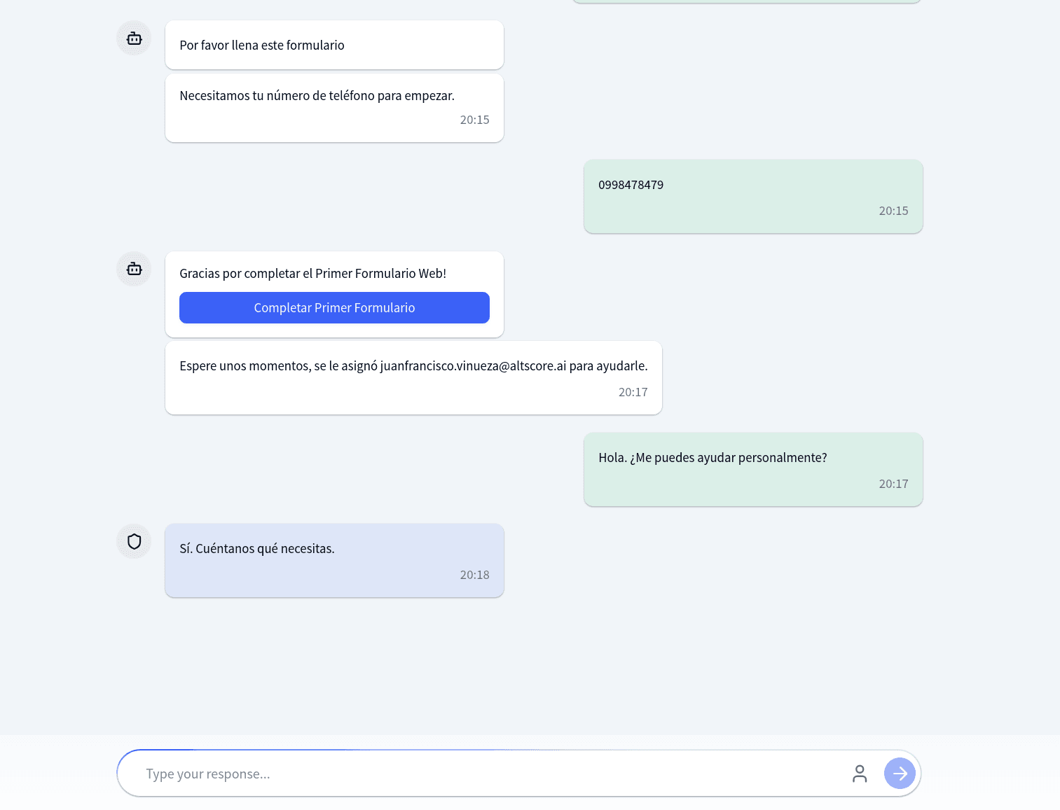
It supports two presentation modes: Chat and Wizard. Both execute the same underlying flow but present it differently. Chat mode looks and feels like a messaging app, with bubbles scrolling down a conversation stream. Wizard mode presents one focused step at a time, like a guided form. You choose which mode to offer by giving customers the corresponding URL.
No login is required. Identity is tracked through browser cookies.
URL Structure
| Mode | URL Pattern |
|---|---|
| Chat | /{tenant}/{flow_alias} |
| Wizard | /{tenant}/wizard/{flow_alias} |
The tenant identifies your organization; the flow alias identifies which flow to run. On load, the portal fetches the flow configuration from the backend — branding, nodes, edges, and any global keywords injected from the web connector. If the flow is not found or not active, the start screen shows an error.
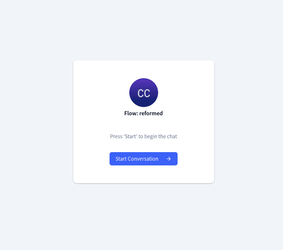
Customers see a branded start screen with your logo, name, description, and a button to begin. Returning customers who still have a valid session cookie skip this screen and pick up where they left off.
The session cookie is scoped to the flow alias, not the tenant. A customer can have active conversations in multiple flows simultaneously, each with its own independent session.
Chat Mode vs Wizard Mode
| Aspect | Chat Mode | Wizard Mode |
|---|---|---|
| Layout | Scrollable message stream | One step per screen |
| Navigation | Forward-only | Back and forward arrows |
| Progress | None | Percentage progress bar |
| Sidebar | None | Optional branding panel |
| Free-text input | Only during agent sessions | Not available |
| Forms | Modal overlay | Integrated as wizard steps |
| Agent escalation | Inline in stream | Transition screen, then redirects to chat |
Chat mode
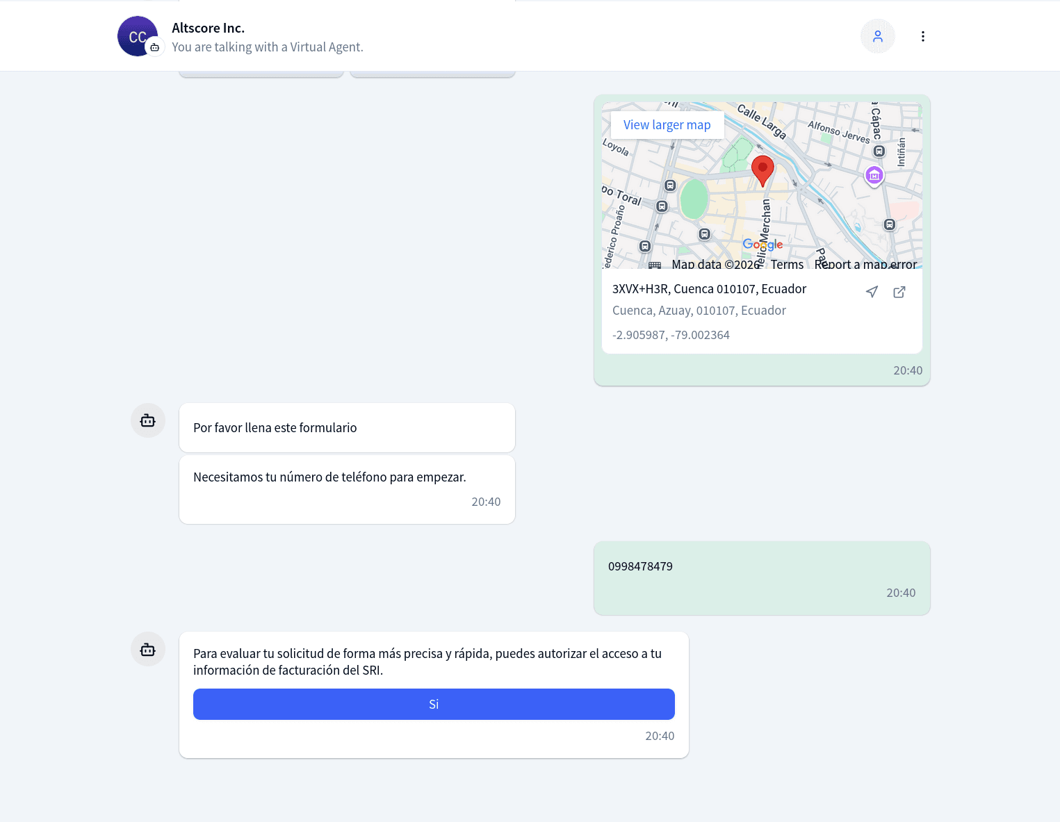
Messages appear as bubbles — bot on the left, customer on the right. Interactive options render as buttons below the message. A typing indicator shows while the bot responds.
Wizard mode
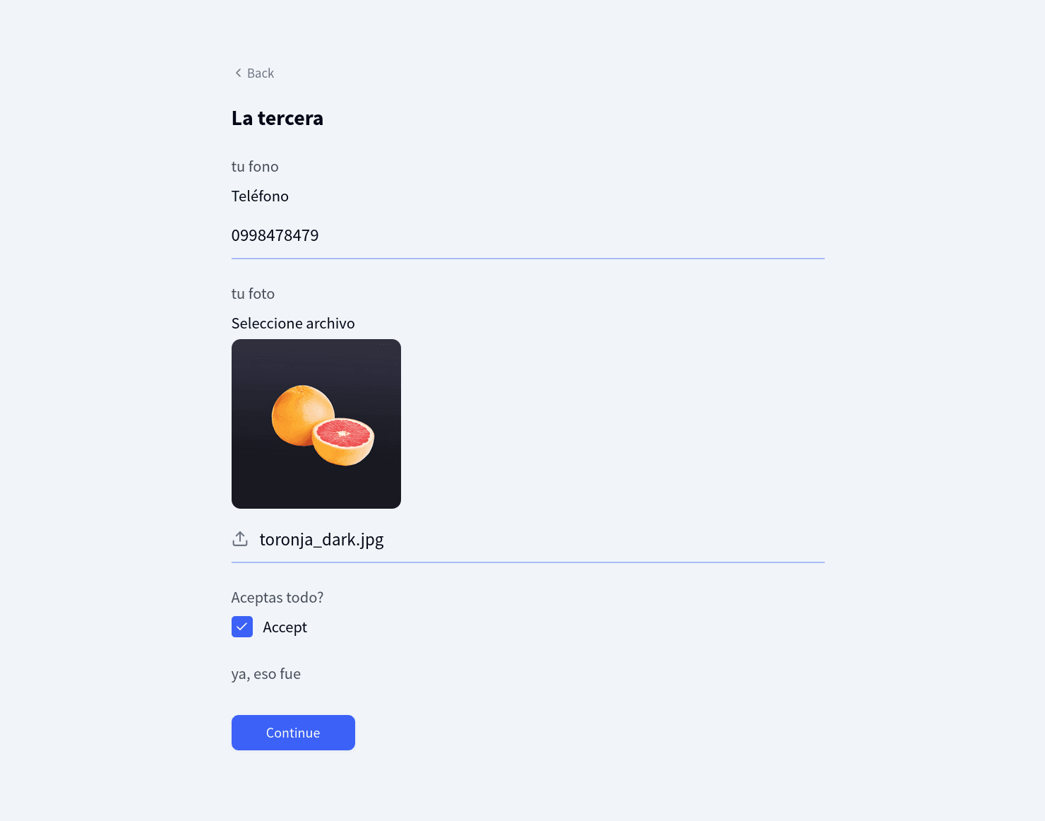
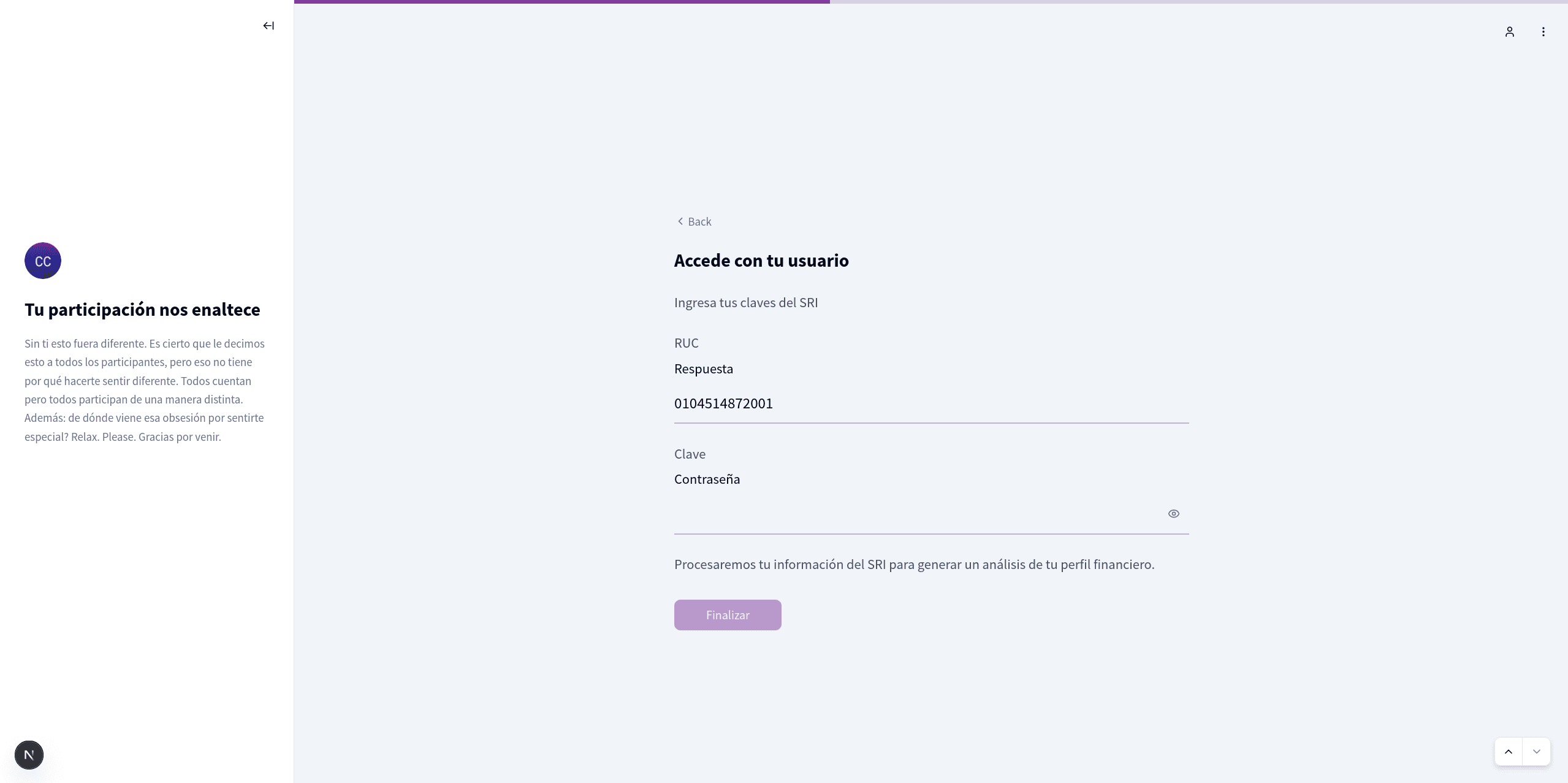
Each step fills the viewport with a centered card. Input fields are large and focused. Navigation arrows let customers review earlier answers, and a progress bar at the top estimates completion based on the flow's graph structure. An optional sidebar keeps your branding visible throughout.
How nodes render
| Node Type | Chat Mode | Wizard Mode |
|---|---|---|
| Message | Text bubble with markdown | Full-width text card |
| Interactive options | Button grid | Large centered buttons |
| Question | Inline text input | Text area with continue button |
| Email / Phone | Typed input in bubble | Dedicated screen with validation |
| Date | Calendar picker | Full date picker with bounds |
| File request | Upload and camera buttons | Upload area with camera option |
| Location | GPS / address search buttons | GPS and address search interface |
| Form | Full-screen modal | Multi-screen integrated steps |
| Send file (bot to customer) | Inline viewer | Preview or download screen |
Mode switching is disabled when a human agent is assigned. If an agent joins while the customer is in wizard mode, the portal redirects to chat mode automatically — agent conversations require the free-text input that only chat mode provides.
Branding
Each flow has its own branding configuration, set through the Web Settings panel in the Hub.
| Field | What it controls |
|---|---|
name | Display name in the header and start screen |
description | Start screen text (supports markdown) |
url_logo | Logo on the start screen, chat header, and wizard sidebar |
url_avatar_chatbot | Small avatar next to bot messages in chat mode |
mainColor | Hex color that drives the entire theme |
buttonText | Custom label for the start button |
sidebarTitle | Heading in the wizard sidebar |
sidebarContent | Body text in the wizard sidebar |
The mainColor hex value is converted to HSL and injected as a CSS variable — every themed element inherits from it. If unset, the portal uses a default blue.
Agent Escalation
Customers can request a human agent through a button in the header. The backend checks support hours and availability. If an agent is assigned, their name replaces the bot name in the header, a divider appears in the stream, and a free-text input opens so the customer can type freely. If no agent responds within about eight seconds, a "No agents available" banner appears.
The agent works from the Support Chat workspace in the Hub.
Support hours are configured on the channel connector, not on the flow.
Sessions and Cookies
Identity is cookie-based — no login, no account creation. When a customer starts a conversation, the portal generates a unique ID, stores it in a cookie, and uses it for all subsequent interactions.
| Cookie | Purpose | Expiry |
|---|---|---|
webflow-{flowAlias} | Session identity — links the browser to a backend conversation | 30 days |
NEXT_LOCALE | Language preference | 1 year |
Returning customers skip the start screen — the portal detects the cookie and loads previous messages. Restarting (via the dropdown menu) deletes the current cookie, generates a new one, clears all local state (form data, navigation history, agent assignment), and sends a fresh start message — effectively beginning a brand-new conversation. The previous conversation still exists in the backend but is no longer reachable from the portal.
Clearing browser cookies or switching devices means losing the session. There is no way to recover a previous conversation.
Forms
When a flow reaches a form node, the portal fetches the form definition and renders it. In chat mode, it opens as a modal that slides up from the bottom. In wizard mode, each form screen becomes an individual wizard step with back-and-forward navigation — customers can revisit earlier screens to edit answers before submitting.
Forms support conditional routing between screens — if a field's value determines which screen comes next, the portal follows the same routing rules you defined in the form editor.
For details on building forms and available field types, see Form Builder and Form Nodes.
File Uploads and Location
Customers can upload files (up to 10 MB) through a file picker or camera — the camera supports photo capture and short video recording (up to 10 seconds). Location can be captured via device GPS or address search; both return coordinates enriched with address components.
Language and Theme
The portal supports English and Spanish, with Spanish as the default. Language is determined by cookie, then browser preference, then default. A dark/light mode toggle follows the OS preference by default. Both are switchable from the dropdown menu.
Things to Know
Keywords come from the connector. Global keywords live on the web channel connector, not on individual flows. The backend injects them into the flow configuration at load time.
One web connector per tenant. All web flows share the same connector configuration for keywords, support hours, and timeout.
Deployment settings live on the connector. Redirect URL, allowed domains, form styles, and the embed code snippet are configured on the connector. See Channel Connectors.
Real-time delivery. Messages arrive instantly through a persistent WebSocket connection — no polling needed. The same channel delivers agent assignment notifications.